creative
expression
Visual Guidelines
Guidelines
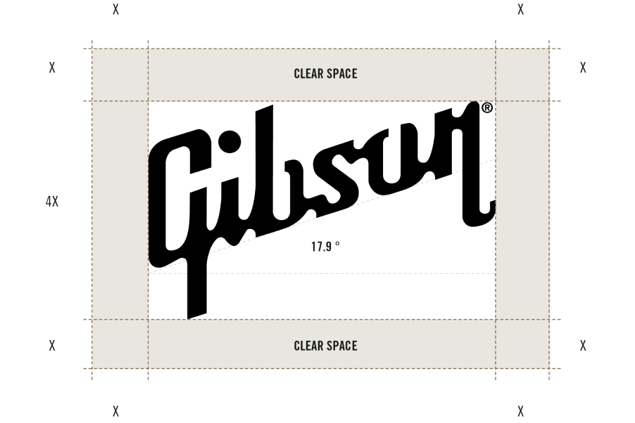
The Gibson logo is rendered at an angle of 17.9 with a registered mark in the upper right. For immediate brand recognition and clean visual impact, the Gibson logo should not be crowded by other visual elements. Do not place graphics or typography within a minimum clear space of onequarter the height of the Gibson logo in all directions.
For maximum legibility, the background should be solid and provide good contrast with the logo. When the background is dark, a reverse logo, in white, may be used.

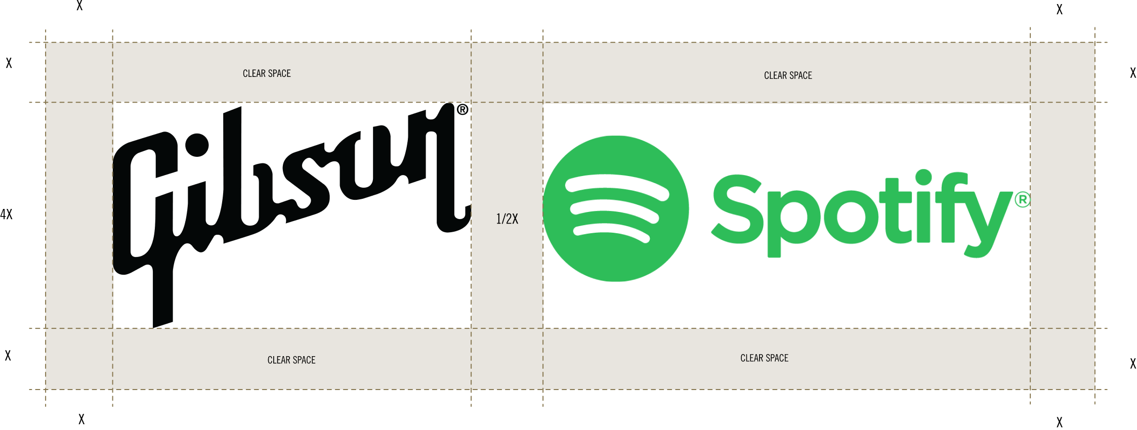
When presented alongside other brands, the Gibson logo should enjoy parity of scale with the other logo(s). The grouping of logos should observe a minimum clear space of one-quarter the height of the Gibson logo in all directions, with a shared clear distance between logos one-quarter the height of the Gibson logo. • All logos should appear on same or equivalent • All logos should appear at the same scale • The logos should not include slogans, urls, etc
RELATIONSHIPS
While creativity is something we champion, a strong brand identity depends on consistent presentation of our brand mark. Variations and improvisations of our logo — such as the misuse cases illustrated on this page — weaken the power and recognition of our brand in the marketplace. Please work with us before deviating from this visual guideline document or the logo files we make available.
LOGO MISUSE
While creativity is something we champion, a strong brand identity depends on consistent presentation of our brand mark. Variations and improvisations of our logo — such as the misuse cases illustrated on this page — weaken the power and recognition of our brand in the marketplace. Please work with us before deviating from this visual guideline document or the logo files we make available.
Do Not-
Crop logo
Do Not-
Change the transparency of the logo
Do Not-
Use different colors
Do Not-
Change the size or position of the logo type
Do Not-
Distort the logo

Do Not-
Use dropshadow or any other effect
Do Not-
Outline the logo
Do Not-
Use background that provide insufiicient contrast
Do Not-
Re-create using any other typeface
Do Not-
Skew the logo
COLOR GUIDELINES
HEX #000000
HEX #FFFFFF
HEX #86764E
HEX #292828
These colors are the visual tone of Gibson. The palette is rich in complementary and contrasting hues that provide flexibility for any application. Use of color variants is acceptable in instances where more than 4 colors are needed, such as graphic, UI elements, and information design.
HEX #8e1204
HEX #5a75a0
HEX #FF3200
Font GUIDELINES
For everyday use we recommend using three styles: Bold condensed, Regular and Light. The condensed version of Trade Gothic is used for branding, reserved for logos and special uses.
EXPLORE.
TRADE GOTHIC • BOLD CONDENSED • 146px
ABCDEFGHIJKLMNOPQRSTUVWXYZ
abcdefghijklmnopqrstuvwxyz
1234567890!@£$%^&*
USAGE CASE EXAMPLE:
LOGOS AND SPECIAL USES
PLAY.
TRADE GOTHIC • BOLD • 146px
ABCDEFGHIJKLMNOPQRSTUVWXYZ
abcdefghijklmnopqrstuvwxyz
1234567890!@£$%^&*
USAGE CASE EXAMPLE:
HEADINGS
SHOP.
TRADE GOTHIC • REGULAR • 146px
ABCDEFGHIJKLMNOPQRSTUVWXYZ
abcdefghijklmnopqrstuvwxyz
1234567890!@£$%^&*
USAGE CASE EXAMPLE:
PARAGRAPHS
LOVE.
TRADE GOTHIC • LIGHT • 146px
ABCDEFGHIJKLMNOPQRSTUVWXYZ
abcdefghijklmnopqrstuvwxyz
1234567890!@£$%^&*
USAGE CASE EXAMPLE:
OPENING PARAGRAPHS
PHOTO APPROACH
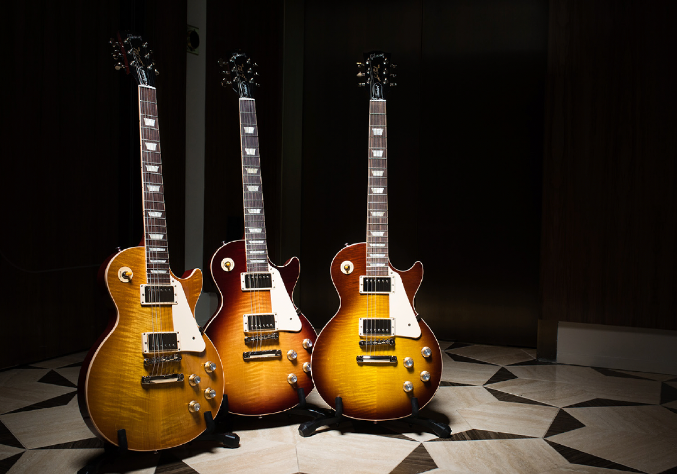
Gibson’s visual storytelling reflects its classic American brand identity, with an emphasis on craftsmanship. In photography, raw materials such as leather, wood, brick, and metal abound in the setting, presenting as clean and refined, even when aged.
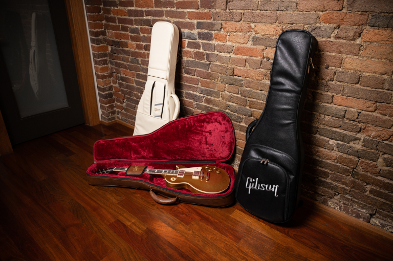


The lighting is moody, with enough shadow to accent the arched tops and other subtle contours and curves. Instruments should be shown in their entirety, or as a body only, or in closeup detail — never a partial neck or haphazard crop. The lens is in the portrait range, 35 - 70mm. When people are seen, they tend to be in a professional setting: the studio or stage.


Download Visual Assets
Download logos, fonts, and color swatches from our online asset library.
(Password may be required.)